The Evander Mills Mysteries

Seedy and delicious, Lavender House is Knives Out with a queer historical twist.
In October of 2021 I received an email from Katie Klimowicz, a Senior Designer at Tor, with the opportunity to pitch sketches for a new novel with this description. Of course I jumped at the chance, and have been lucky enough to work alongside her on 3 titles, and most recently on a fourth with David Rotstein at the series’ new home at Minotaur Books (a different Macmillan imprint).
First was ‘Lavender House,’ and Katie as for two concepts to start (with freedom to pitch any ideas of my own too, of course.)
1: Something more object driven (perhaps a subtle pattern as well?) with a central image with a hook; and
2: Along the lines of Clue and Knives Out, showcasing more of a setting & characters in silhouette in some way.
The first round of sketches I submitted are below, three for each of these two concepts:


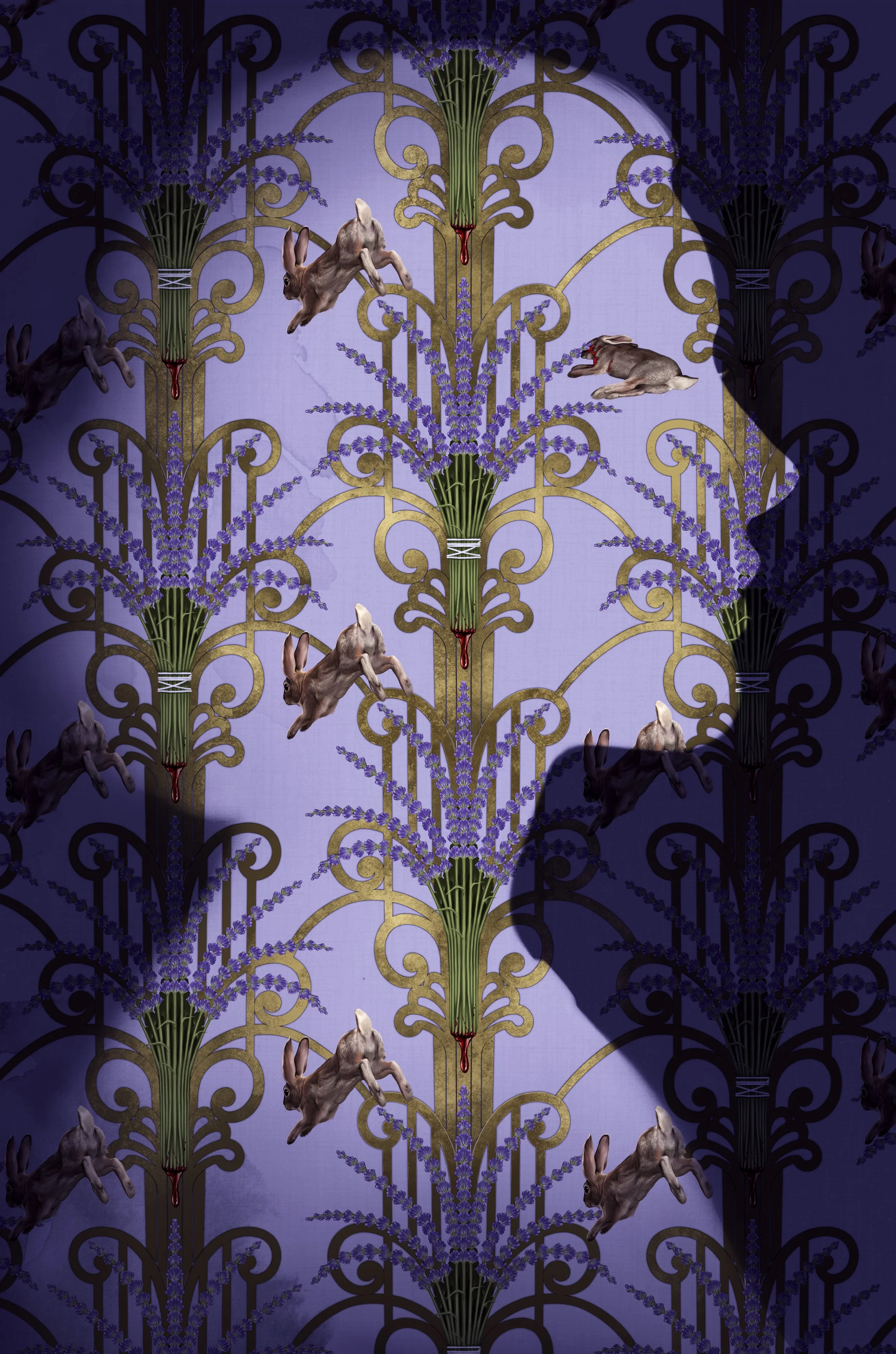
Looking back on it, I still really love a lot of these. Sketches 1, 6, and especially sketch no. 5! But I later learned that the in-house opinion was that the movie-poster, character featured sketches felt a little too ‘graphic-novel’ for an adult mystery novel. The winner of these sketches was no. 3! I was asked to try out a few variations on the object featured in the pattern, swapping out the rabbits for other ideas (shown below).


Of these, I do still like option B..and especially that rip in the wall. But I wasn’t too surprised that the original idea A was what won out in the end, and I got to take that one to a final, below:
I was also asked to rework the pattern to be used as endpapers for the book (which would set a very fun precedent going forward for the rest of the series.) This first book was published in the fall of 2022! And just a couple months after it was released, in November 2022, I was contacted by Katie again about the cover for the sequel, ‘The Bell in the Fog.’
The initial idea for the sequel was to follow the precedent set by the first book, to create a formula with a few twists:
• Finding the new “dead bunny,” an iconic image to build a new wallpaper-esque pattern around
• Changing to a male silhouette, or trying a pair of mirrored silhouettes
Of course, as I have since learned..what seems so simple at first with sequels..never quite ends up being so smooth! The first sketches are below:


Looking back on these (with 2025 eyes,) I can tell how I was a bit frustrated and trying to find something that would stick. There wasn’t really as vivid a particular image as the rabbits in this new book, and I was struggling to find something that worked as well. There is some good in here! The ropes from G would end up being used for the endpapers, and the patterns in B and C also wiggled their way into the cover (and into the promo the author commissioned me to make for the book’s release, check that out here.)
But, with all that said, nothing here was feeling like it was quite ready for the go-ahead, so I was asked to do another round of sketches, with some notes in mind.
• The dual silhouettes were too busy, and focusing on one male one is the way to go.
• The favorite of these was B, which played with not just a flat wall, but breaking out into a more 3-dimensional space, so I was encouraged to think about that idea a bit more.
• The note that we could mirror the original cover by switching the silhouette to a shadow, which could be cast over the environmental elements.
With these notes in mind, I came up with another set of sketches:


With these, we had a winner, E! Which most broke up the “formula” we thought we were setting, and I think is what made it feel most exciting. The final artwork is below. (Peep the pattern from the OG sketches in the bottom right business card!) And no revisions! Long journey in the sketches meant we really knew how the final would work, I guess. :)

Because there wasn’t a pattern in this cover, I was also commissioned to rework one from the original round of sketches for the endpapers for this book. I’m trying to focus this long entry on the covers, but you can see all the endpapers for the books over in this linked gallery.
The book was published in the fall of 2023, but I didn’t have to wait that long to start on the next one! I heard from Katie in August of that year about starting work on the third book, then under a tentative title but eventually released as ‘Rough Pages.’
The idea for this one was that we had sorta blown open our ‘formula’ with the second, so we had a lot more freedom..still with a silhouette, of course!
The ideas were:
• We could return to the silhouette and wallpaper design of the first, with some kind of twist (multiple people, not just a head?)
• We could follow the vibe of the second and have a shadow being cast on some kind of scene
• Or, finally, we could pivot even further and push into a more noir film-still direction, not just focusing on smaller scale scenes.
My inital sketches are below:


Of these the winner for next steps was A (my favorite too!) Personally speaking, I still like the sketch version a lot! I felt like the singing into the mic leant itsself to a double-entendre reading. Like it could also be a scream of fear. But the mic was axed, and I was asked to play around a bit with a few other options, below:


The third from the left in this lineup is what was chosen! With a few notes (changing the angle of the head, clarifying the silhouette of the har) I was given the go-ahead for the final, below:

This one is maybe my favorite of all four..I especially loved how the spines on the books gave me so many opportunities to include nods to all three books in the series. I have to call them out!
• The same sprig of lavender from the first cover is in the bottom row. There’s also a bunny in the center row and a few more stylized sprigs of lavender sprinkled around.
• The pattern from the business card on the second book’s cover is at top right
• The titular ship, ‘ The Bell’ is at bottom left, as well as a design nodding to its wartime dazzle camo at bottom right. There is also a literal bell hidden in the middle row.
• And of course tons of nods to the story of this new book! (The dead fish, and sword/shield) and a few sinister details hiding in there (skulls, the backstabbing hand with a knife)
This one was released in fall of 2024! And, like with the second, I got to create brand new artwork for the endpapers, which you can see here. A few months later, I got a bittersweet update. The series would be continuing, and the author wanted to keep me on to continue making the covers. But his agent had moved the series to a new imprint (from Forge to Minotaur) at the same publisher (Macmillan.) And because of this, after working with Katie on three books over three years, for the fourth book I’d be working with a new art director and a new team. David Rotstein at Minotaur took up the mantle, and had some new ideas for how we could mix up the formula for this slight rebrand/change in imprint:
• He wanted to try a new approach, pivoting away from the silhouettes and shadow shapes of the first 3, and focusing instead on a sort of..M.C. Escher-esque, hidden image concept. Something more subliminal/vague.
• Motorcyclists and the Pacific Coast Highway featured prominently in the plot, so he wanted me to try showing a POV view of a motorcyclist, ideally with the above idea in mind, creating the motorcyclist out of the scenery.
• He was also open to my own ideas for next steps, as long as I showed versions of what he had in mind.
Because this was going to be a bit of a pivot, he was clear that I could keep my initial sketches loose, more like thumbnails and we could go from there. (This is not something I am generally comfortable with, as you might be able to tell from the sketches in this post, ha! I want really badly to communicate my intentions as clearly as possible from the start.) My initial sketches are below (working title ‘The Long Ride’ was eventually changed to ‘Mirage City’):


Honestly! I was a bit skeptical about the hidden image idea, especially once I started drawing. The image of the POV of a motorcyclist especially felt overly complicated to try to make work out of the scenery the way David was envisioning. And once I’d drawn it up it felt SO different from the first three, I wasn’t really sold on the idea that it could sit on the shelf next to the others. So while I did try as hard as I could to make his idea come to life with A-C above, while I was working I also really tried hard to think about what I would do for the third bullet point, for “my” idea of how to make this new idea fit better alongside the first three. And I distilled the first covers down to two main concepts, and decided this new book would need either:
• Some kind of face.
• A shadow form or silhouette.
So that’s how I landed on D-F, trying to either have the new idea be that the shadow makes not a face but a motocycle, or that the face isn’t a shadow but a hidden image, part of some environment.
For the next steps, David was happy with E, but wasn’t ready to let go of A, and asked me to make slightly more detailed color comps up for both (below).


There was no denying that the one on the left felt better as part of the series, so I was getting my way! Still, though, I am very thankful for David and his vision because this did feel like a really fresh and exciting next step for the series that I don’t think I would have landed on without him pushing me to try out these new ideas.
Still though, there was one more note for this before going ahead! Them team wanted to add a vista of Los Angeles somehow, to make the setting really clear.
I was a little unsure about this, how to make it not feel totally tacked on as an afterthought. But I thought maybe if it was a fading in vignette in the corner, it could have a sort of..pulpy, retro mystery feel, which suited the plot. The initial note came with a photo reference, which I referred to when making the sketch on the left, below. The feedback there was that the orange was distracting, and that the author had pointed out that the buildings and height of the palm trees might fit with our current mental picture of Los Angeles, but was a bit anachronistic for the time period (oops!!) So I reworked to a more period-appropriate scene of the city, with a cooler tone, below right.


This sketch was approved to go to a final, below:

Once again, I got to make endpapers for this book! They’ve not been revealed yet, but when the book is released this fall they’ll be updated alongside the others.
The future of this series is a bit in flux..we’re not sure if there will be another book after this fourth one. But I am immensely proud of the work I’ve done on them over the past 4 years. When I started doing these I was only a couple years out of an MFA program, and Lavender House was one of the first 10 books I worked on. Now, 4 years later and writing this in the spring of 2025, I’ve worked on almost 70. Lev and I have become real life friends, my partner and I have had dinners with him and his husband at their place several times. And he’s not only hired me himself to make fun added artwork for promotional materials (matchbooks, bookmarks, etc.) but also uplifted me and recommended me to so many other art directors. It’s been quite a ride working on this series, and really a joy to come back to it every year. I also love these damn books! Every year since the first I’ve been so excited to get the draft and just devoured it. I’m so unbelievably grateful to Lev, Katie, and now David too, and anyone else who has had a hand in making these books a reality. I’d be thrilled if we got to do more, but if we don’t, Andy will always have a massive place in my heart. :)